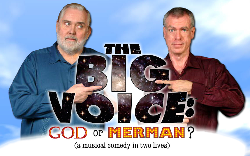
 Jim saw what I was doing with the photos and, after going through them, found another of himself that he liked just a bit better because he thought it was wackier, thus showing the comic side better. So I replaced it and I think he's right! If you click on the image, you can see it in much better detail.
I'm still working with the thumbnails from our photo shoot. After we decide -- or if we decide -- to more seriously use one of these designs, I'll redo it with the high res photo. As it is, you can see a little of the jpg flaws around our eyes.
What do you think? Better? More fun? I like this one best of all, I think.
2 comments:
oh, the eye-rolling fer shur! I like the subtle "it's really HIM that's the big mouth, er, voice" on his face and the "innocent" look on your face.
hee hee hee hee hee (don't mind me I'm just going to sit over here in the corner and giggle at you guys for a while)
Brian
Please giggle away!
Post a Comment